Since 2020, our team focusing on eXtended Reality (XR) at Deloitte Digital Belgium has been exploring the edges of immersive technology: experimenting, prototyping, and learning our way through a rapidly evolving landscape. With approximately 20% of our time dedicated to Research & Development, we’ve built a rich body of work that spans both client-driven projects and internal Proofs of Concept (PoC), reflecting not only technological progress but also the team’s growing intuition about what meaningful, human-centered XR can be.
This article is part of a chronological series that retraces the hidden side of that R&D journey: each article highlights one POC: the context in which it was created, the technology choices behind it, the challenges we faced, and the insights that shaped our next steps. Together, these stories reveal how experimentation fuels capability building.
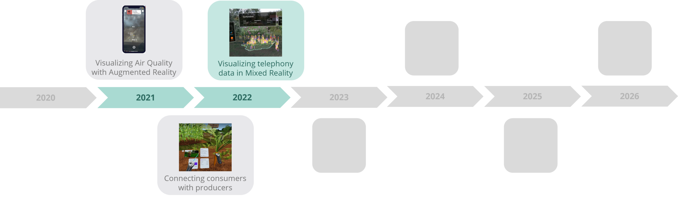
Next projects to be revealed soon…
When coverage data needs terrain
Some coverage problems are hard to understand on a flat map. Especially when you need to make the decision about the location of your next antenna to ensure proper coverage and avoid white spots (areas with no coverage at all).
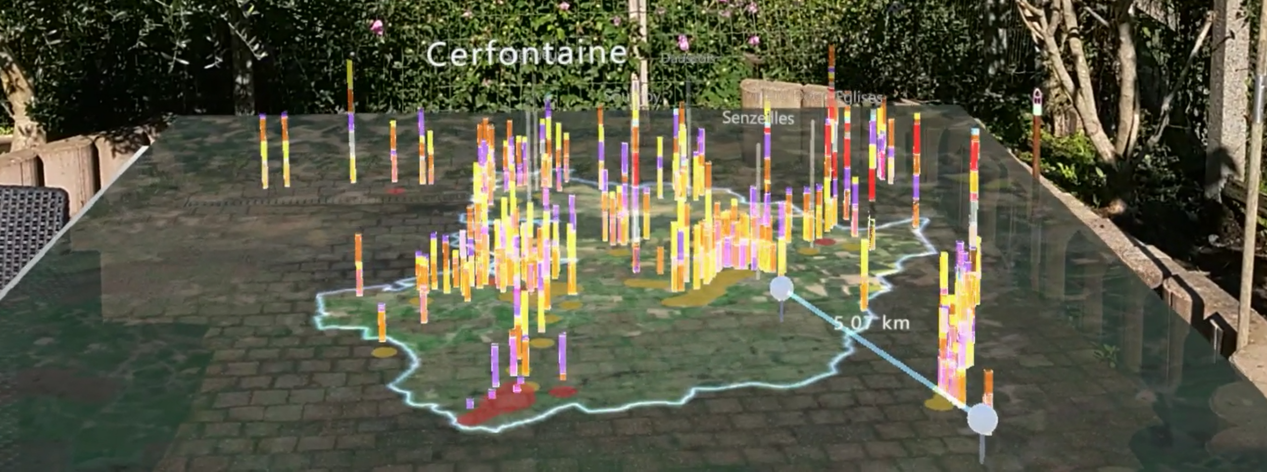
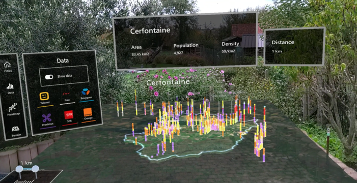
That was the starting point for the 3G/4G/5G coverage visualization in this Mixed Reality proof of concept. The idea was to take geolocated telecom coverage data from rural areas and place it on a 3D topographic map, viewed through HoloLens 2.
The problem was simple enough to explain. Rural areas had weak or missing mobile coverage, and the available data could show where those gaps appeared. What it could not always explain was why they appeared.Was the signal weak because the area was too far from an antenna? Was one provider missing coverage in that location? Was the issue linked to terrain, forests, valleys, or isolation?
A color-coded heatmap could point to the weak zone. The mixed reality prototype tried to show the context around it.
The headset had limits
But displaying all that data came with a problem. The headset had to show hundreds of small data points at once, and that pushed the hardware to its limits. The more points on screen, the slower the headset became, and when a headset struggles, users notice immediately. The visualization becomes hard to read and uncomfortable to wear.
The team spent around one to two weeks focused on making the experience smoother. They tested several changes, including:
- Adjusting how the data points looked and how transparent they were
- Changing the way the data was drawn on screen
- Combining multiple data points into single visual elements to reduce the workload
- Making data points permanent once they appeared, rather than constantly updating them
- Fine-tuning the headset’s settings to improve overall performance
These were practical fixes, but the lesson was broader. In mixed reality, performance is not just a technical detail—it’s part of the experience itself. If the headset struggles, the user feels it immediately. The visualization may still be technically correct, but it becomes harder to read, harder to trust, and less comfortable to use.
This project made that constraint very concrete for the team.
Designing a menu for a headset is completely different
Interaction design became another important learning area because this was still early territory for the team from a User Experience (UX) point of view.
Designing a menu for a headset is completely different from designing one for a phone or website. In a phone app, the menu stays in one place on the screen. In a headset, the menu floats in space around you. That creates new problems: Where should it appear? Should it follow you as you move? Should it attach to your wrist? How do you prevent accidental clicks?
The intended users were not expected to be technical, and many would not have experience with mixed reality headsets. The interface had to be easy to find, easy to dismiss, and hard to trigger by accident.
The team tried several menu placements. A floating menu that followed the user around the map created problems. When the menu moved with you, it was easy to accidentally press buttons as your hand moved. That defeated the purpose of having a simple interface.
A wrist-mounted menu seemed like a good idea, but it created a different problem. Depending on how you held your arm, some buttons became awkward or impossible to reach. In some positions, your wrist would actually block the buttons from being pressed.
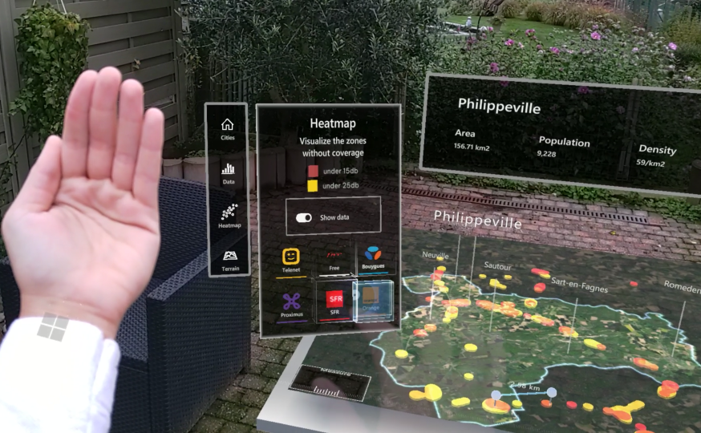
The solution was a palm-up menu. When the user raised their hand with the palm facing them, the panel appeared. When they lowered the hand, it disappeared.
It was a small design decision, but it mattered. The menu was the main interactive element in the application. If that interaction felt clumsy, the rest of the experience suffered. The team learned that in mixed reality, you have to design for how people actually move their bodies, not just how they move a mouse or touch a screen.
The team carried this lesson into later work: XR interaction design has to account for the body, the space, and the interface at the same time. A menu can work in a technical sense and still feel wrong if it fights the way people actually move.
What the team kept from this project
The clearest legacy of the project was performance optimization.
The techniques tested here became part of the team’s broader mixed reality practice: reducing the number of visual elements on screen, combining elements where possible, optimizing how data was displayed, making objects permanent once created, and fine-tuning headset settings.
The project also influenced how the team thought about hand menus. It showed the limits of attaching interface elements directly to the hand or wrist, especially for users who are new to immersive devices.
Later work continued in the same direction: fewer buttons, more natural inputs, and interfaces that appear only when they are needed.
If we rebuilt it today
If the team rebuilt this prototype today, the hardware choice would likely be different.
Newer headset generations and, in particular, Apple Vision Pro as a possible option for higher visual quality and stronger performance. More capable hardware would allow a richer map, more detail in the coverage data, and less pressure to reduce visual quality for performance reasons.
The bigger change would be the scale of the experience.
Instead of only viewing weak coverage zones from above, users could move from the map into a 1:1 perspective. They could select a weak point and virtually stand in that location to inspect the surroundings.
Are there houses nearby? Is the area surrounded by trees? Does the terrain block the signal? Is the issue infrastructure, geography, or both?
That would turn the prototype into a more immersive way to investigate coverage problems, rather than only a better way to view them.

Julie Morand
Senior Unity Developer