Designing mixed reality (MR) experiences that are intuitive, engaging, and satisfying for users require great user experience (UX) design. MR refers to the integration of digital content with the physical world, allowing for a seamless blend of the two. This technology has the potential to revolutionise the way we interact with the world around us, but only if the UX is carefully considered and well-executed.
Over the last year, our team has experimented with mixed-reality headsets. We have built several proofs of concept to understand the feasibility of mixed reality and the potential for our clients. Here’s what we have learned.
1. Design with spatial awareness
It is a rule that is true for any design: you must understand the context in which the user will interact with your solution. With mixed reality design, however, this concept is taken to a whole new level. It is essential to know the environment in which the user will use the solution. What does it look like? Is there enough space? Are they alone or with others? Will they be indoors or outside? What is the level of noise surrounding them? Will voice commands be successful? All of these questions are integral in influencing the design and the interactions.
2. Sound & Spatial audio
By using spatial audio, designers can create a more immersive and engaging experience for users. For example, when a user moves their head, the audio can change to match their new perspective, creating a more realistic and engaging experience. Audio can also be used as a means to provide feedback to the users. Since there are no controllers to receive tactile sensations. For example, when a user touches an object in the MR environment, they can hear a gentle sound, giving them a confirmation that their action has been registered. This can help to make the MR experience feel more real and immersive, as it allows users to engage with the content in a more tactile and natural way.
3. Depth & SCale
One of the most essential aspects of mixed reality design is accounting for an extra dimension. Traditional UI’s closest comparison to this is the Z-index and how modals can appear “in front” of other elements. In mixed reality, this depth is tangible, and must be taken into account when designing interactions. Users can zoom in on an element with a gesture of their hands, walk closer, or lean in for a closer look. Sizing UI and holograms is a delicate process. While they need to be easily readable, they also need to be manipulable. Large objects are more noticeable but more difficult to manipulate, and small objects are easier to manipulate but harder to spot. A good compromise is to keep elements that need to be read at arm’s length and within the field of view, and elements that need to be manipulated within the user’s reach.
4. Field of View
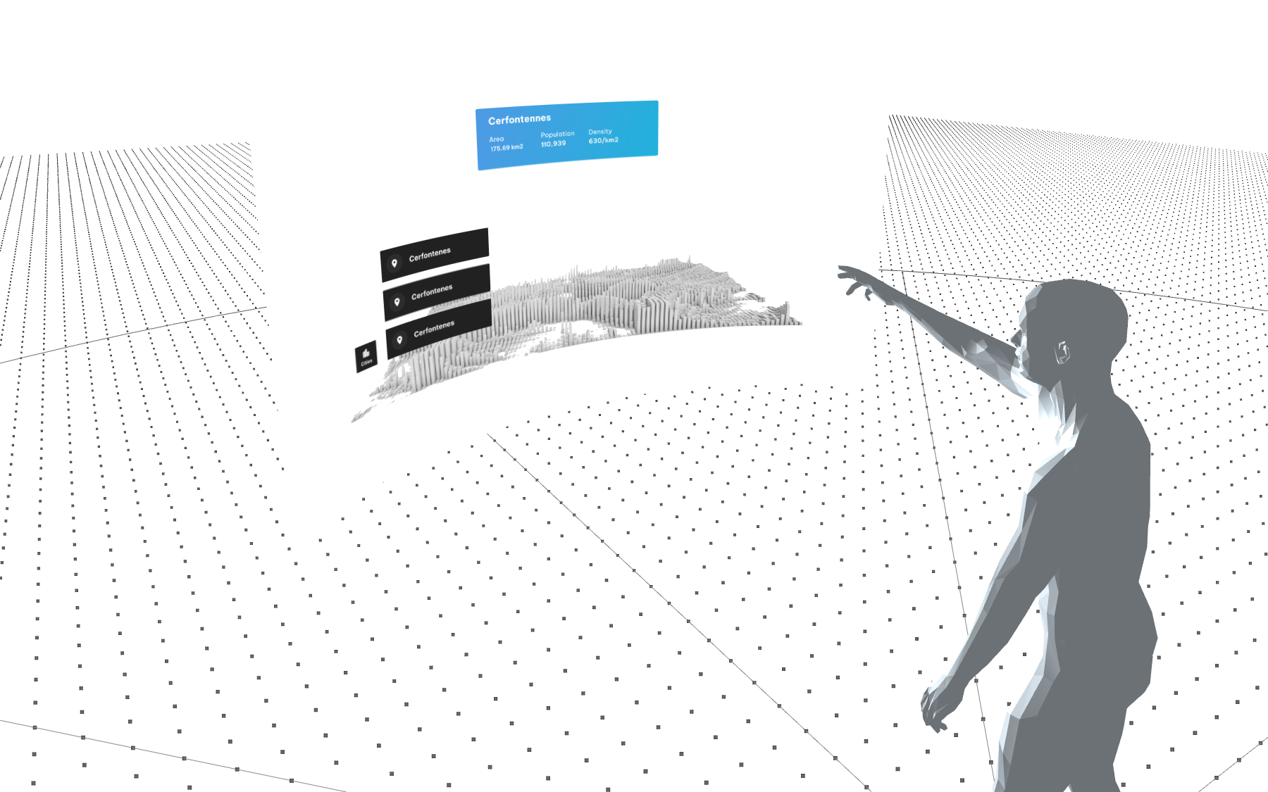
Pixels, points, rems, inches, centimetres. Designers have to deal with a lot of different units when designing for different mediums, but XR introduces degrees. Field of view (FoV) is the range of the observable world visible at any given time through the human eye. Devices such as the Hololens 2 or VR headsets have a smaller field of view. This limitation should be kept in mind when designing the experience. Think of it as a similar concept as the fold on a web browser, but with a 360° arc. What part of your experience is directly visible in the FoV of the user, what part is outside and how will you guide the user to these parts? A combination of visual hints and sounds can be used to grab the attention of the user to the elements outside of their field of view.
5. Prototyping and Testing
TLDR; it is hard. Developing mixed reality applications is complex and time-consuming. It is very important to validate and test as much as possible ahead of time. We have established 4 levels of fidelity for prototyping mixed reality solutions.
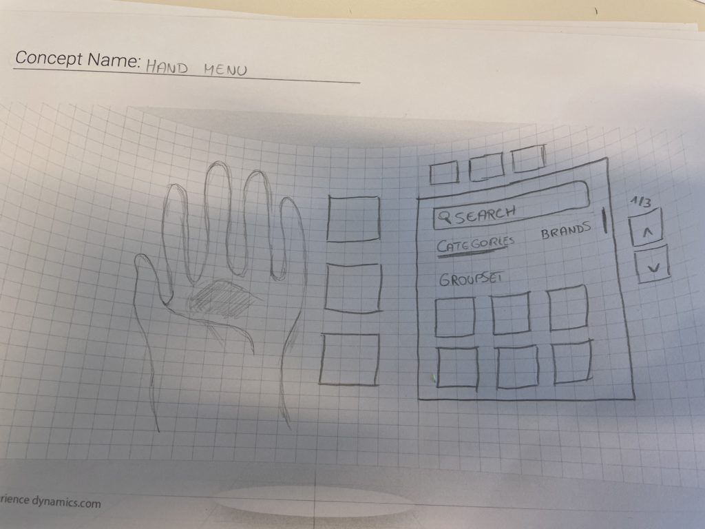
Level 1: Pen and paper
Establishing user flows and storyboarding your concept will already allow you to test the high-level concept of your solution and align stakeholders, designers and developers on the desired outcome.
Level 2: Cardboard
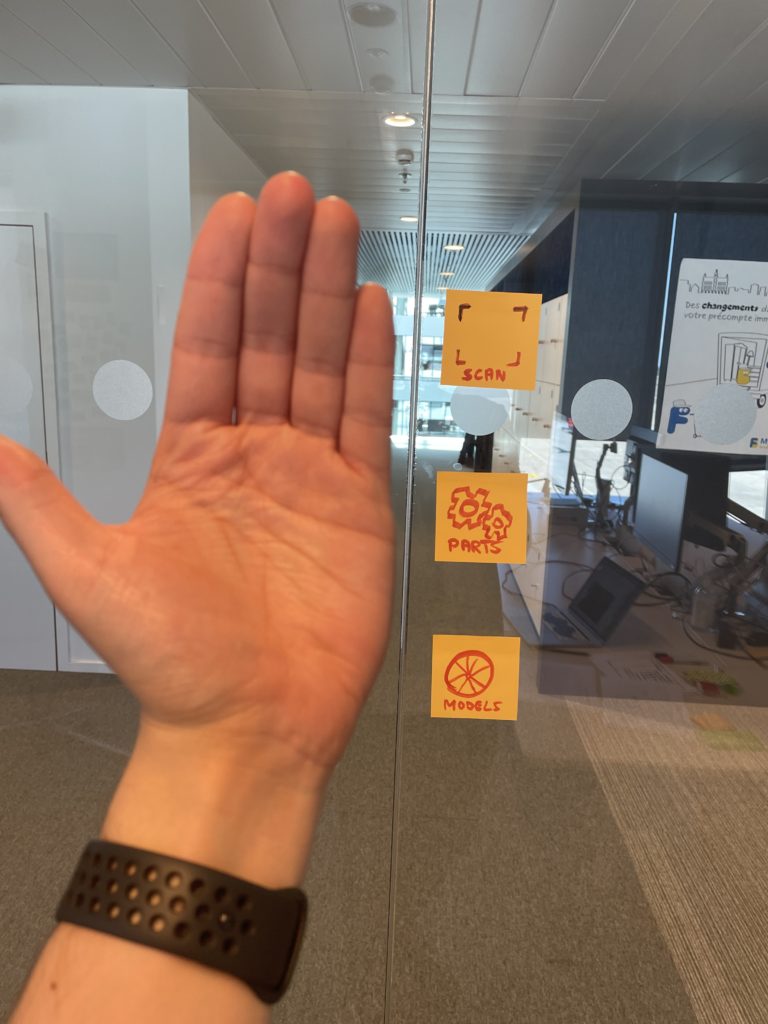
We have mentioned how spatial design has a huge influence on the design of mixed-reality applications. You will want to test your solution in the environment in which it will be used to identify any potential issues. You can use cardboard to simulate holograms and sheets of paper attached to clothing hangers to simulate UI panels.
Level 3: Blockout 3D
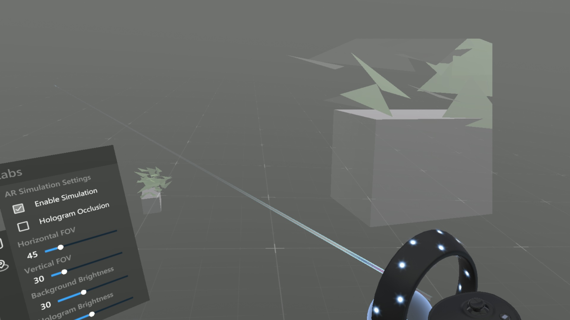
When you have a good idea of the flow and functionalities of your application, you will need to test it in an actual headset. First block out 3D (3D objects without any texturing or details) to test the interaction patterns that you have established. We have used Microsoft Maquette to prototype our solution at this stage. It works with any VR headset and you can simulate the hologram renders of the Hololens 2 headset. Plus you have access to a default UI library of Microsoft for all your UI needs at this stage. The big limitation is that depending on your headset you will need controllers which is a different way of interacting. You will also require lots of actual space, which can be problematic when you’re working from home during a pandemic. Thankfully our dedicated XR space in our office solves this issue. To prepare these “mockups” we use a combination of Figma for the UI elements and Blender or Spline to add depth, 3D elements and place the UI in space.
Level 4: Application test
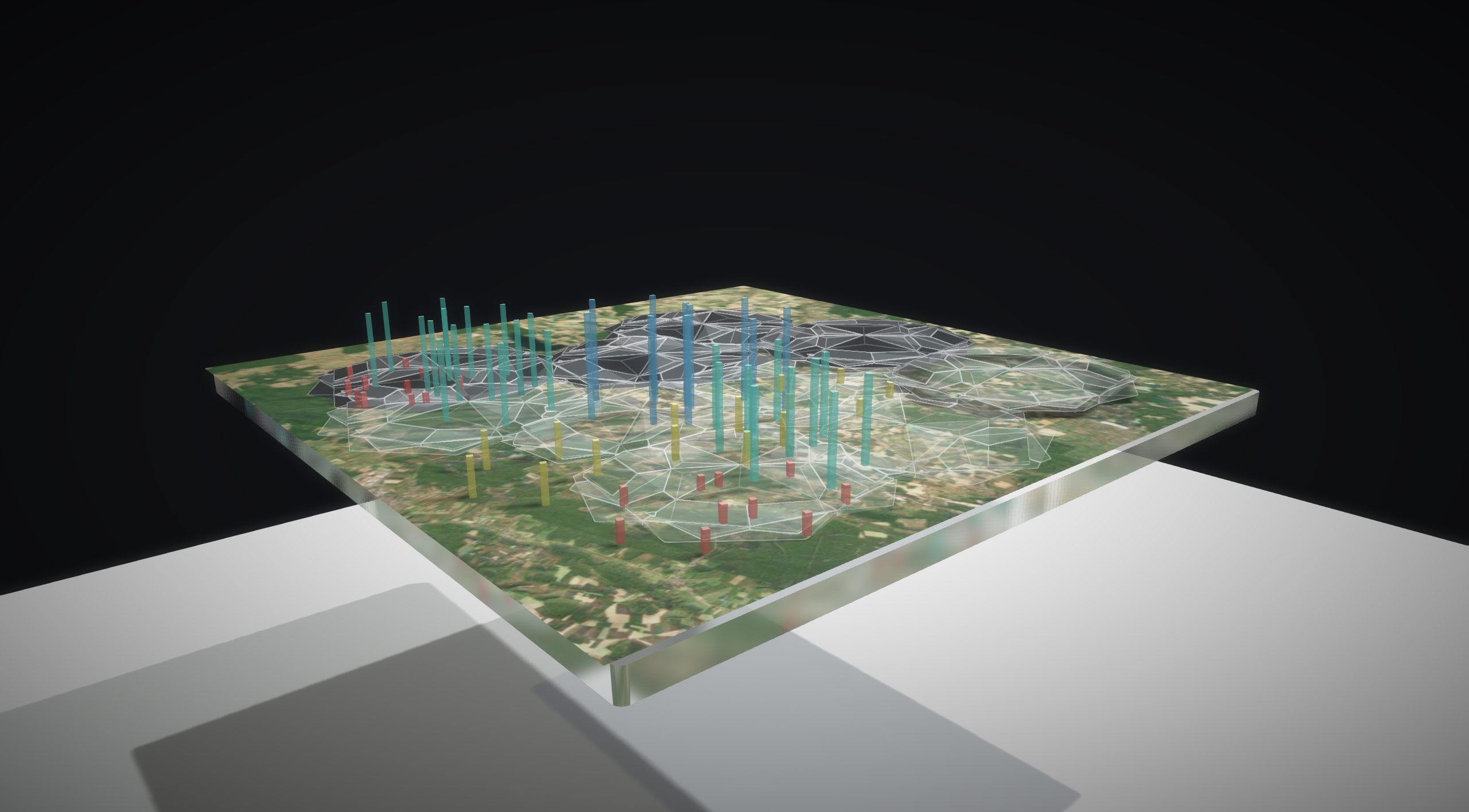
The last level of the test is made with the actual Hololens device. This is where you can evaluate higher-level features such as gesture recognition, level of detail and performance.
6. UI and Interactions
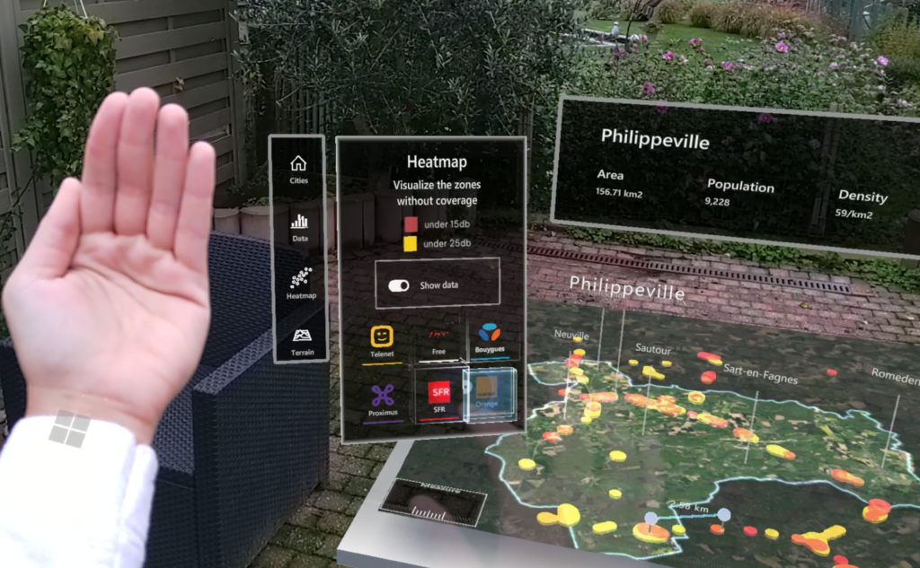
Less is more. This is a relevant statement in many instances for conventional web or mobile design. And once again even more important for mixed reality. Direct interaction with holograms should be privileged whenever possible over UI interactions. Real-world analogues and skeuomorphism in particular have had the best results. Conventional UI elements like tabs, buttons, sliders or input fields are to be avoided. They take away from the experience and users are not sure how to interact with them with their hands alone.
Intuitive interfaces are a myth. What we call intuitive is rather a recollection of something familiar, of a learned pattern that you can reapply. Something human beings are great at. It is not a surprise that every user has struggled during our testing, to interact with any kind of user interface. Because they lacked a previous comparable experience. People had to learn how to use a keyboard and a mouse. People had to learn how to use touch interfaces. They now seem intuitive because people have a set of expectations on how to interact with these devices and interfaces. Mixed reality introduces a new set of controls and with it new interactions and UI elements. The first experience with a mixed reality headset is full of apprehension, interaction is tentative and users are constantly questioning if they are doing the right thing.
People are far less hesitant to manipulate 3D objects, holograms, that resemble the real world. They will try to grab and throw objects if the object looks like it could be moved.
What’s next
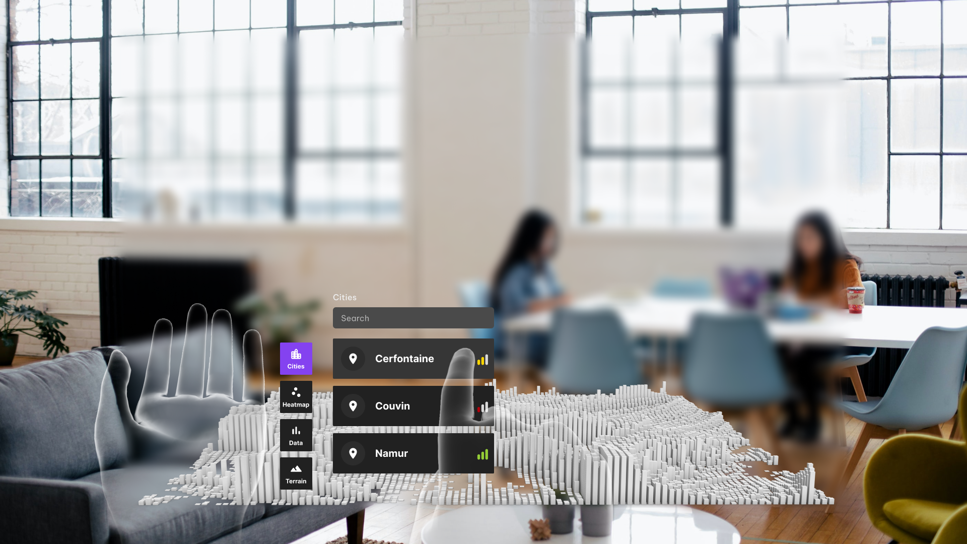
One of the biggest challenges in UX design for MR is the need to create intuitive and natural interactions. Since MR technology blurs the line between the physical and digital worlds, it can be difficult for users to understand how to interact with MR content. UX designers must work to create clear and straightforward interactions that allow users to easily navigate and engage with MR content. This is achieved by experimenting with prototypes through many iterations and testing with your target audience.
We have learned that Microsoft has decided to stop further development on the HoloLens 2. But we remain enthusiastic about mixed reality’s potential and the new headset delivered by the likes of Meta and HP.
Real world application
The potential benefits of mixed reality (MR) extend across many different industries. MR technology has the ability to revolutionise the way we interact with the world around us, and has the potential to provide numerous benefits to various industries.
One industry that stands to benefit greatly from MR is healthcare. MR technology has the potential to greatly enhance the way doctors diagnose and treat patients. For example, MR technology could be used to create immersive 3D visualisations of a patient’s internal organs, allowing doctors to more accurately diagnose and treat medical conditions. Additionally, MR technology could be used to provide virtual reality training simulations for medical professionals, allowing them to hone their skills and improve patient care.
Another industry that could benefit from MR is education. MR technology has the potential to greatly enhance the learning experience for students. For example, MR technology could be used to create interactive 3D visualisations of complex concepts, allowing students to more easily understand and retain information. Additionally, MR technology could be used to provide immersive virtual field trips, allowing students to experience places and events that they might not otherwise have the opportunity to visit.
Overall, the potential benefits of MR are vast and varied. This technology has the potential to greatly enhance many different industries, providing numerous benefits to both businesses and consumers.

