Creating a user interface is often a key part of the projects we typically do at our Digital Studio. Designs of the user interface come to life after an elaborate process of service designers identifying use cases and doing field research, UX designers creating wireframes and describing the information architecture, and UI designers converting those wireframes into final screens and components.
Often, the UI designer also creates a Design System with the design tokens of the application. We’ll talk about the Design System a bit further.
Translating the user interface designs into an actual user interface in the application is crucial to the success of a project in the Digital Studio. Hence, the UI designer and frontend developer must work together efficiently. The frontend developer must understand the vision the UI designer has for the application.
To enable efficient collaboration, a couple of tools/methodologies can be used:
Invision
Invision focuses on a clickable prototype:
- It’s easy for a frontend developer to click through the full to-be application and understand the context and use cases.
- If a user story would concern not a single screen, but an interaction between screens, the clickable prototype can help greatly in understanding this interaction.
- A link to a specific screen can be easily added to a user story.
- The Inspect function enables a developer to get all the variables required for implementing the design and have quick access to all the assets for that screen.
- It’s also possible for the developer and the UI designer (in addition to other people) to add comments to specific pinpoints on the screen to discuss.
One caveat though: Make sure that when you create and edit clickable prototypes, you also create and update the links to and from different screens (and interactions) to make sure the interactivity keeps making sense. Stale links or expected links that do nothing frustrate the frontend developer and can make it hard to go through the prototype.
Abstract
One issue we’ve been having with Invision though is that it doesn’t always match nicely between the workflow of the developer and that of the UI designer. The issue occurs when designs of screens that are meant to be done change after the user stories of that screen were estimated.
We’ve had this problem during a sprint, where the user story still describes an old version of the design, but the Invision link would already show an updated version. If this occurs, ideally we would want to still have the old design available that matches the user story. This design can then be implemented during the ongoing sprint. The requested design change can then be properly planned in the next sprint.
Luckily, with Abstract, it’s possible for UI/UX designers to also use versioning and branches with their designs, quite similar to how developers would use git for instance: git for designers! This way, when the user stories are being written, they can be based on a certain branch or version of the designs, and links to the screens of that specific version can be added to the description of the user story. One downside though is that you don’t have a clickable prototype in Abstract.
Sketch
If the frontend developer has a Mac and a license for Sketch, just simply giving the Sketch file might be an option as well. This gives the developer full insight into how the design was made, direct access to all the assets and a nice storyboard of all the screens.
However, by using a file, this opens up the possibility of not having the latest designs. Also, the abstraction level might not be ideal as the developer gets more information from looking at the Sketch file than necessary.
Component Library
Nowadays, Component Driven Development (CDD) and Atomic Design are becoming more and more popular with frameworks like React, Vue, and Angular. With CDD, all the components like buttons, headers, and cards are created before later assembling them into screens. Ideally, the UI designer should also work with components in their designs such that there is maximal reuse of the implemented component library. Using Sketch with this approach might make more sense as this way the developer can also look at the symbols created by the designer.
Design System
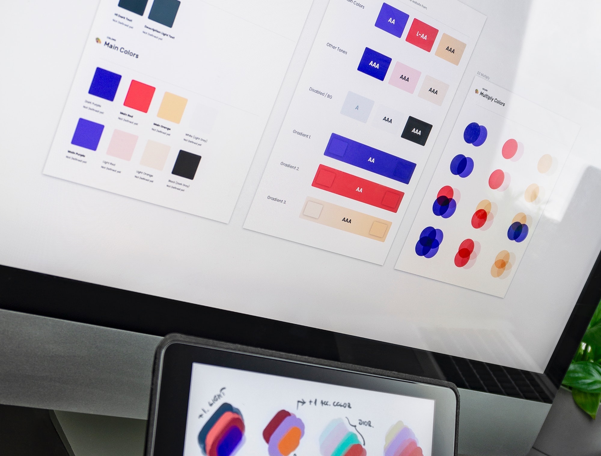
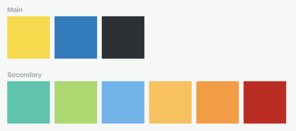
Having an actual Design System (for instance in Invision or Sketch file) can also help a frontend developer enormously. Defining visual design atoms (design tokens) like colors, dimensions, shadows, typography, spacing and timing by a designer instead of having a frontend developer extract this information out of screen designs speeds up the process and allows for a much more consistent design. The Lonely Planet has a nice example of how they integrate their design tokens into a component library.
Often, these design atoms translate almost directly into code. For instance, when using LESS for the styling of a website, there is often a theme variables file that would contain a lot of these design atoms in the form of variables that can be used throughout the rest of the styling.
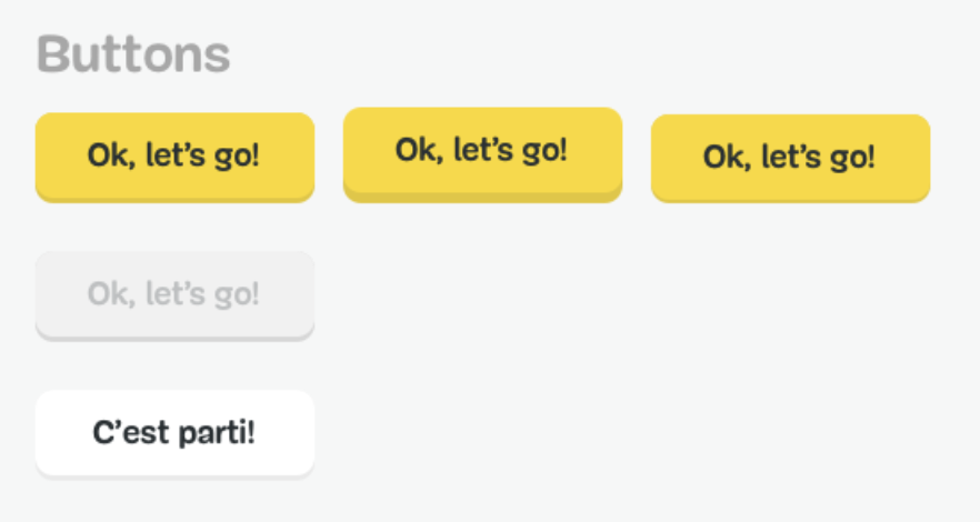
By combining visual design atoms, the different states (normal, hover, active, disabled) of different button types (primary, secondary) can be recreated.
While these tools help us a lot to efficiently work together, some details can still get lost in translation and require a face-to-face conversation. There are of course many other tools that do similar things and work in other use cases. Feel free to comment below and share your design tools for sharing information between designers and developers!
If you were ever confused between front-end and back-end developers, have a look at our latest article on the subject!

